Visual Alignment for Icons and Labels in Tailwind CSS
- tailwindcss
- design
- layout
- alignment
- geoicons
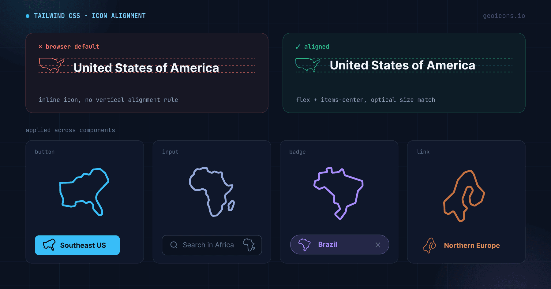
Vector icons do not line up with text out of the box. Unlike letters, graphic paths lack a consistent baseline, ascender, or descender. If you place an icon next to a text label using browser defaults, the shape floats above or below the text baseline.
We use GeoIcons components for the examples in this post. The library includes clean, optimized map outlines for all countries and regions. Because each shape is a real geographic outline rather than a uniform square glyph, the same alignment rules you would use for any icon apply directly, and each component exposes size and className props to make them easy to apply.
You can fix this visual gap with Tailwind CSS flexbox utilities and relative sizing.
Key takeaways
- Flexbox alignment anchors the visual centers of icons and text.
- Sizing utilities map the SVG bounds to the text line-height.
- Translation utilities correct visual offset in asymmetric country shapes.
Anchor the visual centers
Use flexbox to align the icon container and the text block. A standard block layout stacks the elements. Raw inline SVG elements line up the bottom edge of the canvas with the text baseline, pushing the icon upward.
Wrap the icon and the text in a container with flex alignment:
import { Japan } from '@geoicons/react/countries';

export default function CountryBadge() {
  return (
    <div className="flex items-center gap-2">
      <Japan size={20} aria-hidden="true" />
      <span>Japan</span>
    </div>
  );
}
The items-center utility aligns the vertical midpoints of both child elements. The gap-2 utility adds a consistent horizontal spacer.
Match icon size to line height
Scale the icon height to match the text line-height. Standard Tailwind body text uses the text-base class, which carries a font size of 16px and a line-height of 24px. If you set the icon height to 16px, the icon sits within a 24px vertical container, causing a vertical mismatch.
Set the icon height to match the line-height of the text:
{/* For text-base (24px line-height), use a 20px icon */}
<div className="flex items-center gap-2 text-base leading-6">
  <UnitedStates className="h-5 w-5" aria-hidden="true" />
  <span>United States</span>
</div>

{/* For text-sm (20px line-height), use a 16px icon */}
<div className="flex items-center gap-2 text-sm leading-5">
  <UnitedStates className="h-4 w-4" aria-hidden="true" />
  <span>United States</span>
</div>
Choosing an icon height smaller than the line-height leaves space for the border of the icon to sit clear of adjacent text lines.
Correct asymmetric visual weight
Every country has its own distinctive proportions. A long, narrow country like Italy or Chile sits differently within its square canvas than a compact country like France or Poland. The browser centers the bounding box of the SVG, but the visual weight of the shape can sit slightly off-center.
You can correct this offset using relative translation classes on the icon element:
import { Italy } from '@geoicons/react/countries';

export default function ItalyListRow() {
  return (
    <div className="flex items-center gap-2">
      <Italy className="h-5 w-5 translate-y-[1px]" aria-hidden="true" />
      <span>Italy</span>
    </div>
  );
}
The translate-y-px utility shifts the vector shape down by one pixel, centering the visual weight of the path relative to the uppercase characters of the text label.
Put it together: common UI patterns
The rules above (flex centering, size matched to line-height, an optional pixel nudge) carry over to real components. Here are a few patterns you will reach for most often.
Buttons
A button already sets its own line-height and padding, so lean on inline-flex items-center and let the icon inherit the button's text size. Size the icon a touch below the label so it reads as a companion to the text rather than competing with it.
import { Japan } from '@geoicons/react/countries';

export default function ShipToButton() {
  return (
    <button
      type="button"
      className="inline-flex items-center gap-2 rounded-md bg-slate-900 px-4 py-2 text-sm font-medium text-white"
    >
      <Japan className="h-4 w-4" aria-hidden="true" />
      Ship to Japan
    </button>
  );
}
The label already names the country, so the icon is decorative: keep aria-hidden="true" and let the text carry the meaning for screen readers.
List rows
Lists are where alignment matters most, because any drift repeats down the whole column. Set one icon size for the list and align every row the same way. The visual center stays locked regardless of how wide or narrow each country's outline is.
import { Italy } from '@geoicons/react/countries';
import { UnitedStates } from '@geoicons/react/countries';
import { Japan } from '@geoicons/react/countries';

const countries = [
  { code: 'US', name: 'United States', Icon: UnitedStates },
  { code: 'IT', name: 'Italy', Icon: Italy },
  { code: 'JP', name: 'Japan', Icon: Japan },
];

export default function CountryList() {
  return (
    <ul className="divide-y divide-slate-200">
      {countries.map(({ code, name, Icon }) => (
        <li key={code} className="flex items-center gap-3 py-2 text-base">
          <Icon className="h-5 w-5 shrink-0" aria-hidden="true" />
          <span>{name}</span>
        </li>
      ))}
    </ul>
  );
}
The shrink-0 utility stops the icon from squeezing when a long country name wraps, keeping the left edge of every label flush.
Inputs
For a country field, place the icon inside the input using absolute positioning and pad the text so it never overlaps the shape. Vertical centering comes from top-1/2 plus a -translate-y-1/2 nudge, which keeps the icon centered no matter the input height.
import { UnitedStates } from '@geoicons/react/countries';

export default function CountryInput() {
  return (
    <div className="relative">
      <UnitedStates
        className="pointer-events-none absolute left-3 top-1/2 h-5 w-5 -translate-y-1/2"
        aria-hidden="true"
      />
      <input
        type="text"
        defaultValue="United States"
        className="w-full rounded-md border border-slate-300 py-2 pl-10 pr-3 text-base"
      />
    </div>
  );
}
The pointer-events-none utility lets clicks pass through the icon to the field, so the input stays fully focusable and editable.
Inline with text
Inside a sentence, set the icon's width and height in em units so they track the surrounding font size automatically, and add a small translate-y to sit it on the text baseline. The h-[1em] w-[1em] classes are still the usual width and height, just expressed relative to the text instead of a fixed pixel value.
import { Italy } from '@geoicons/react/countries';

export default function InlineMention() {
  return (
    <p className="text-base">
      Our team just opened a new office in{' '}
      <span className="inline-flex items-center gap-1 font-medium">
        <Italy className="h-[1em] w-[1em] translate-y-px" aria-hidden="true" />
        Italy
      </span>
      .
    </p>
  );
}
Because the width and height are 1em, the icon scales with the text: bump the paragraph to text-lg and the icon grows with it, no extra classes needed.
Every pattern here reuses the same three ideas, so once the alignment feels right in one component it stays right everywhere you drop an icon.